(01)
(01)
(01)
Herb Island
Herb Island
Herb Island
Herb Island is a skincare and haircare brand focused on natural, plant-based ingredients designed to be both effective and affordable. Targeted at a Tier 2 audience, Herb Island’s aim is to make quality skincare accessible without compromising on effectiveness. As a passion project, I created a complete brand identity for Herb Island to capture its natural essence and appeal to budget-conscious customers.
Herb Island is a skincare and haircare brand focused on natural, plant-based ingredients designed to be both effective and affordable. Targeted at a Tier 2 audience, Herb Island’s aim is to make quality skincare accessible without compromising on effectiveness. As a passion project, I created a complete brand identity for Herb Island to capture its natural essence and appeal to budget-conscious customers.
Herb Island is a skincare and haircare brand focused on natural, plant-based ingredients designed to be both effective and affordable. Targeted at a Tier 2 audience, Herb Island’s aim is to make quality skincare accessible without compromising on effectiveness. As a passion project, I created a complete brand identity for Herb Island to capture its natural essence and appeal to budget-conscious customers.
2024
2024
2024
Industry:
Communication & Marketing
Industry: Personal care
Industry:
Communication & Marketing
Services:
Brand Identity
Services: Brand Identity & Packaging Design
Services:
Brand Identity
Client:
Anirudh, Ant Works
Client: Passion Project
Client:
Anirudh, Ant Works
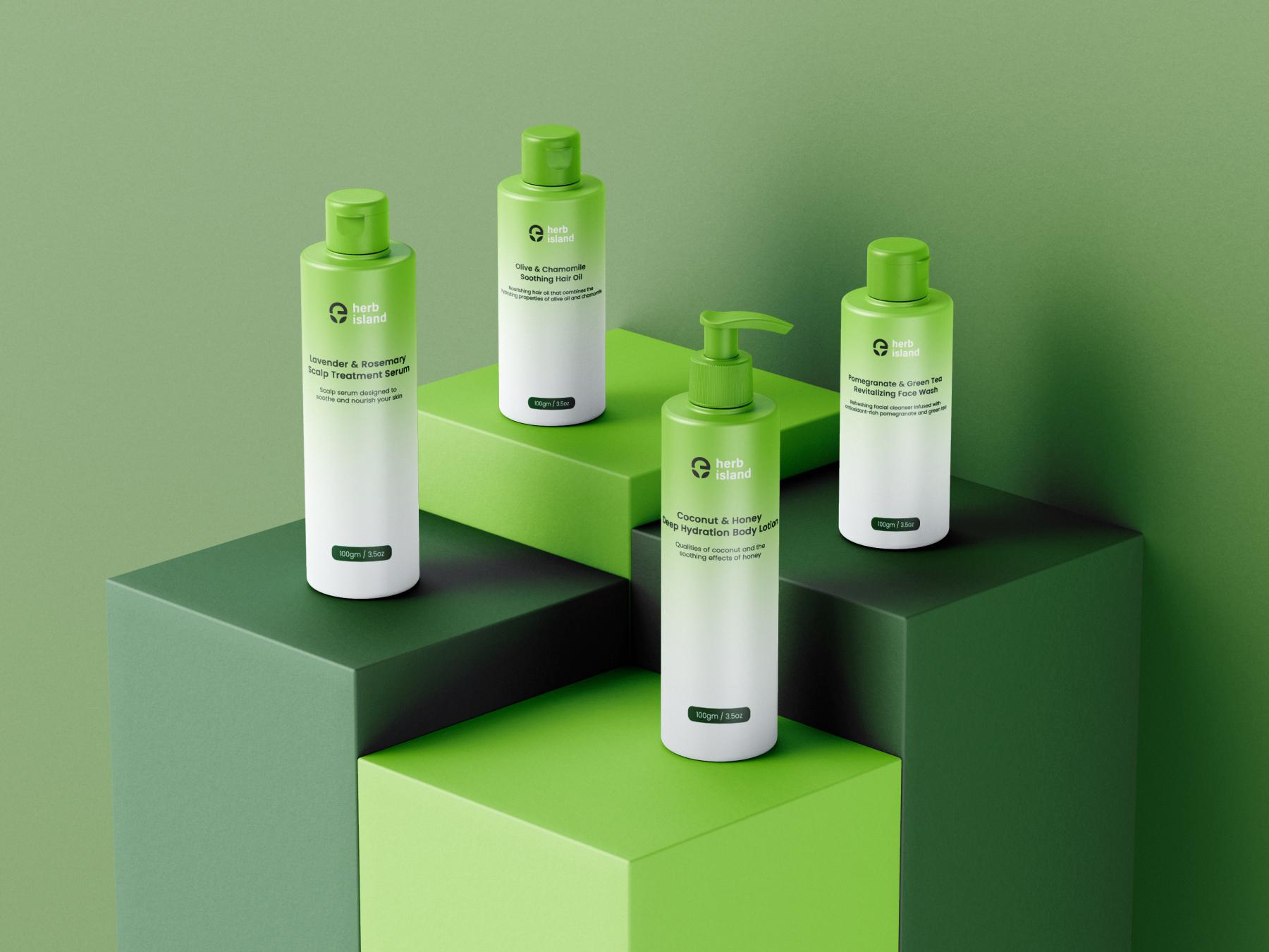
The mission was to develop a brand identity that felt accessible, trustworthy, and connected to nature.
The mission was to develop a brand identity that felt accessible, trustworthy, and connected to nature.
The mission was to develop a brand identity that felt accessible, trustworthy, and connected to nature.
Compelling Event →
Compelling Event →
Compelling Event →
For Herb Island’s brand identity, the goal was to create a look and feel that aligned with its plant-based focus. The aim was to design an identity that would make customers feel like they were choosing a brand that’s good for both their skin and their wallet. By building a clean, natural, and approachable aesthetic, I set out to reflect Herb Island’s commitment to quality and accessibility.
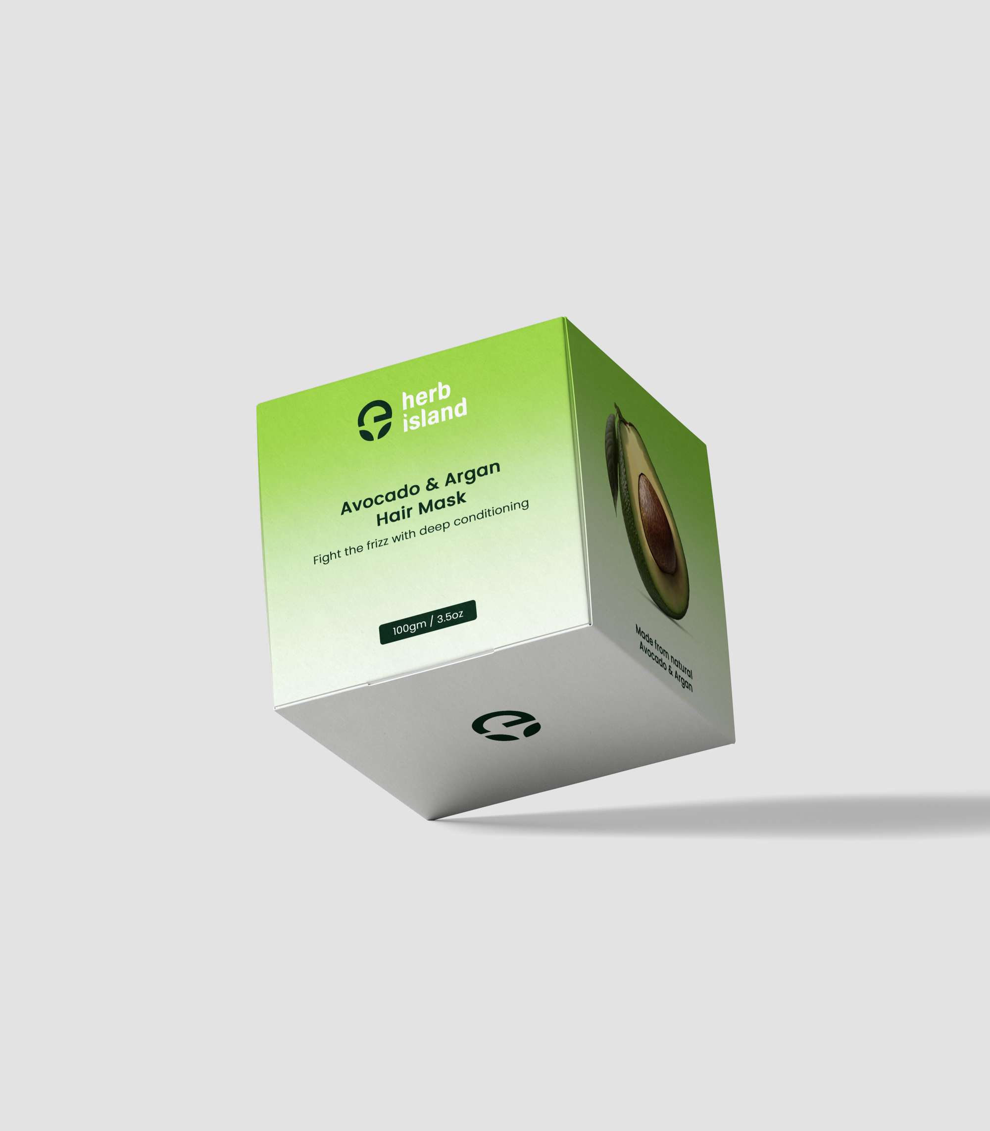
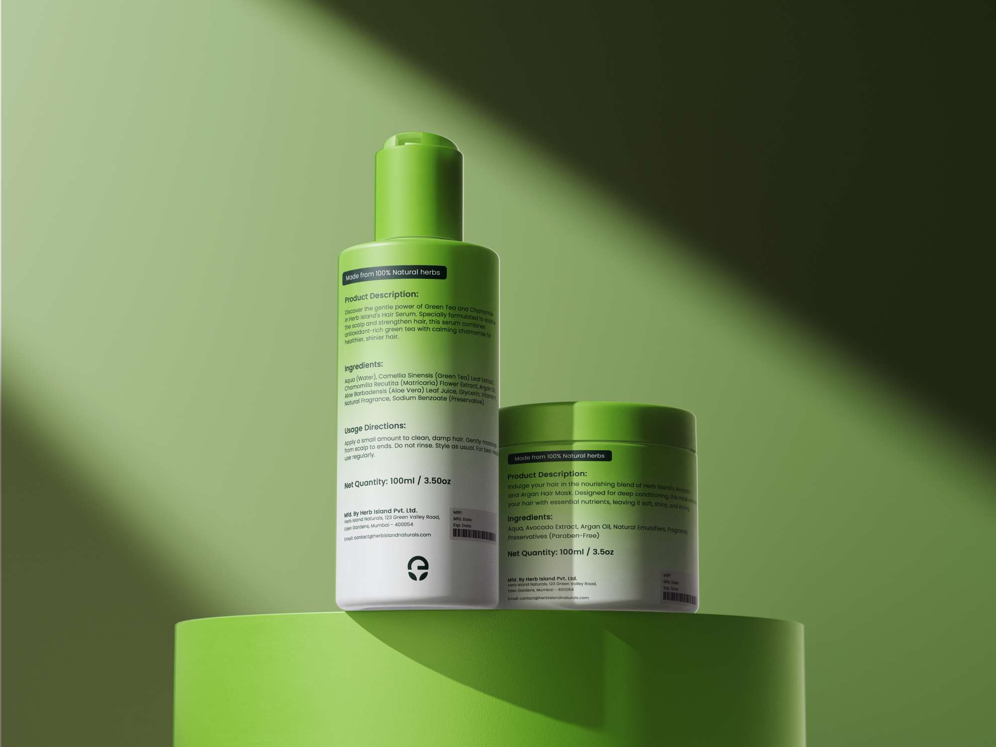
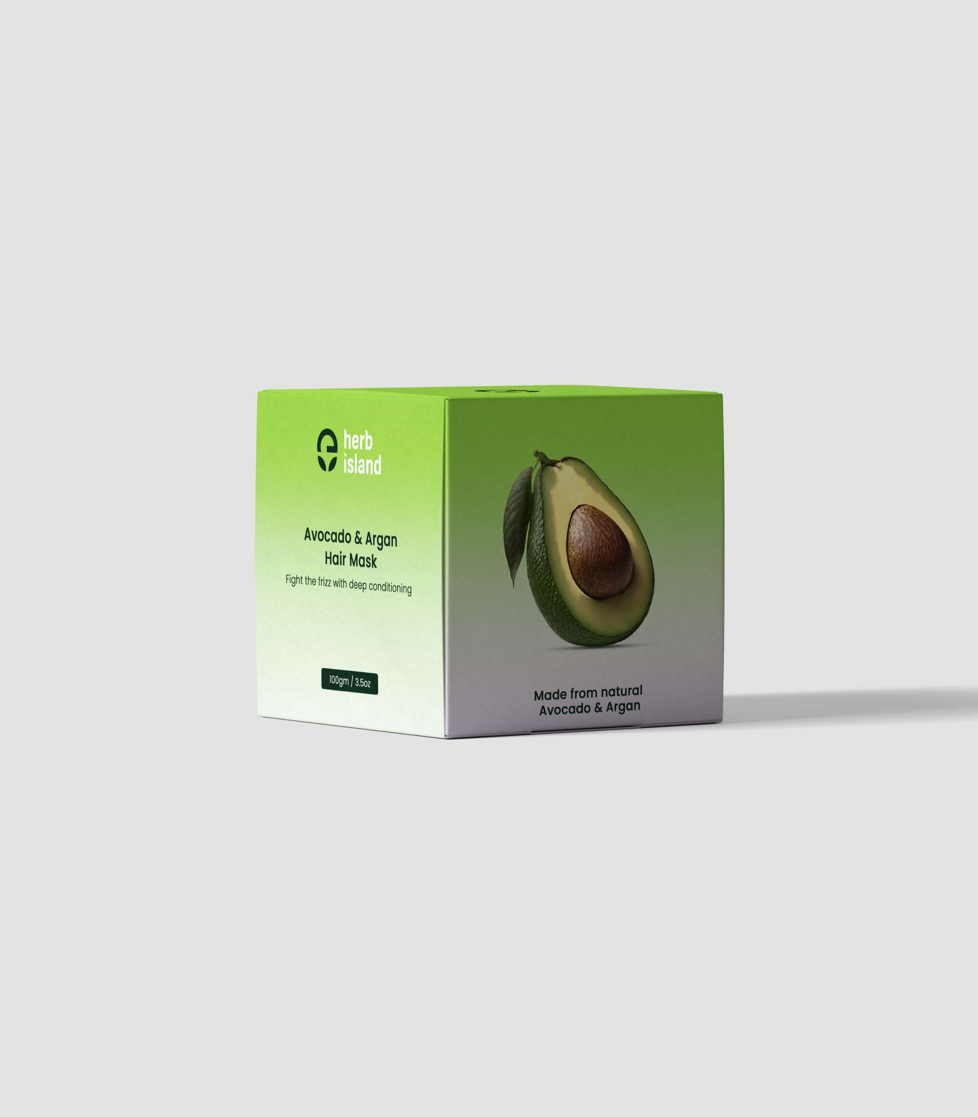
Working on Herb Island as a passion project gave me the opportunity to design a full brand identity, from logo to packaging. I wanted to show how effective design could capture a brand’s mission and resonate with its audience. Herb Island’s visual identity is built around the idea of quality, affordability, and nature, creating a cohesive look that represents the brand’s core values.
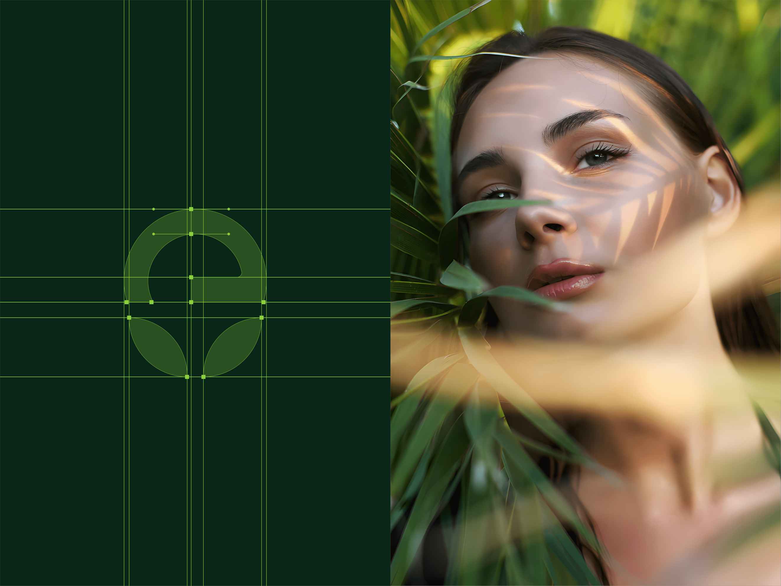
The process focused on understanding user behavior and designing with a natural, approachable aesthetic.
The process focused on understanding user behavior and designing with a natural, approachable aesthetic.
The process focused on understanding user behavior and designing with a natural, approachable aesthetic.
The process & outcome →
The process & outcome →
The process & outcome →
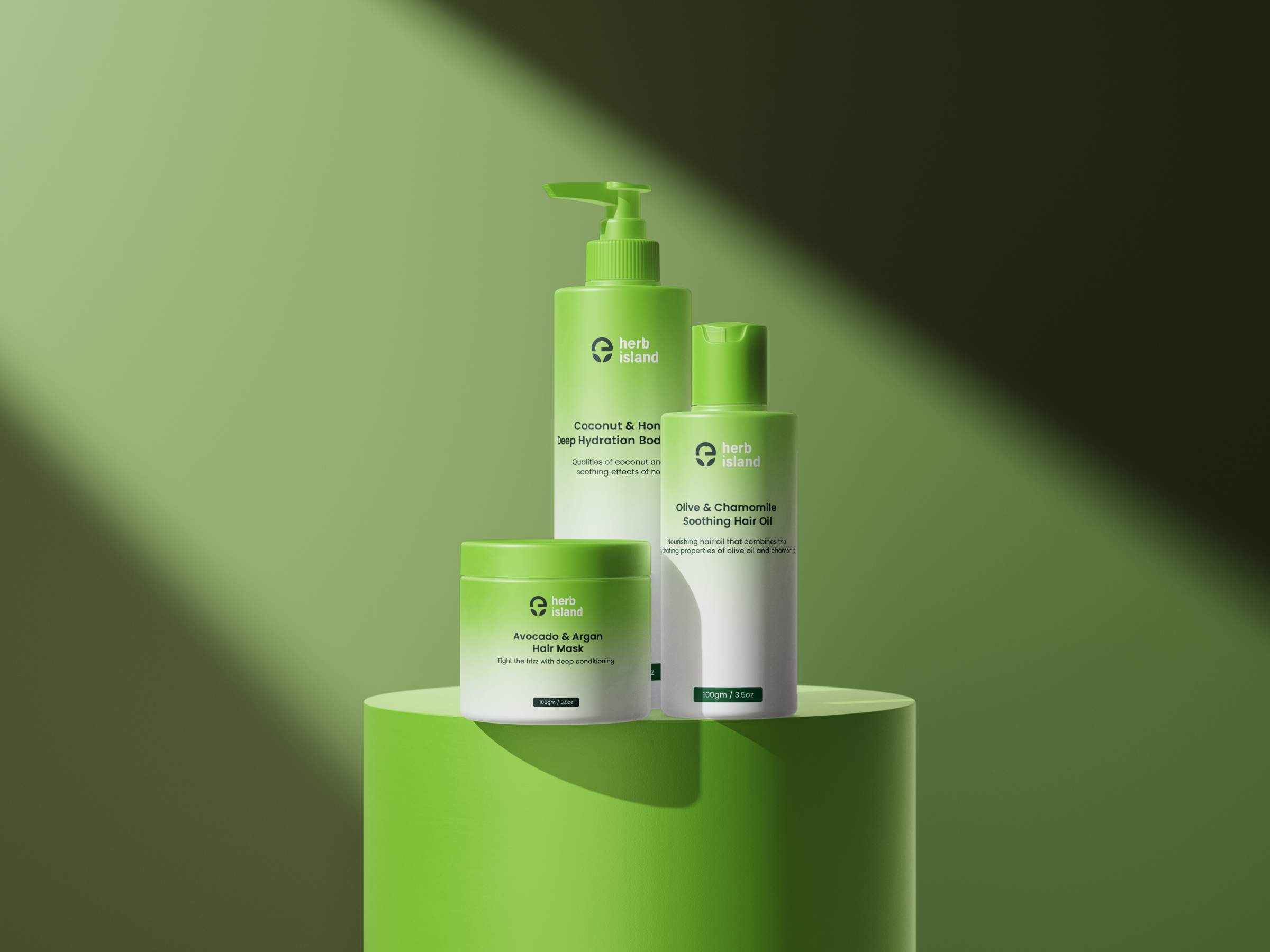
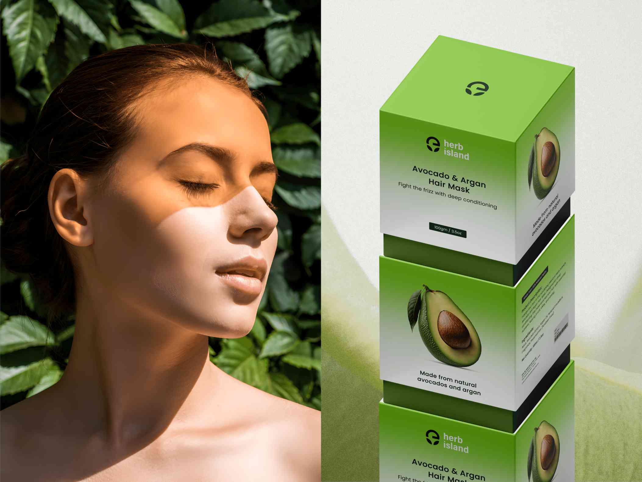
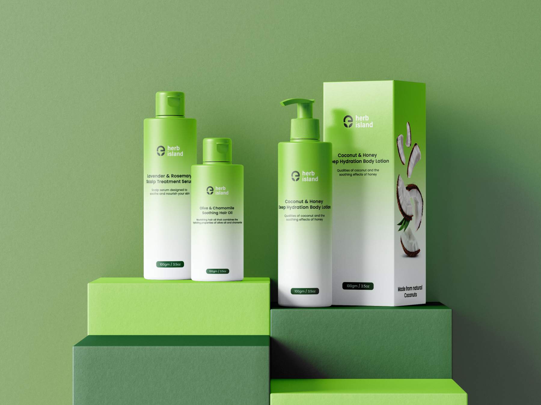
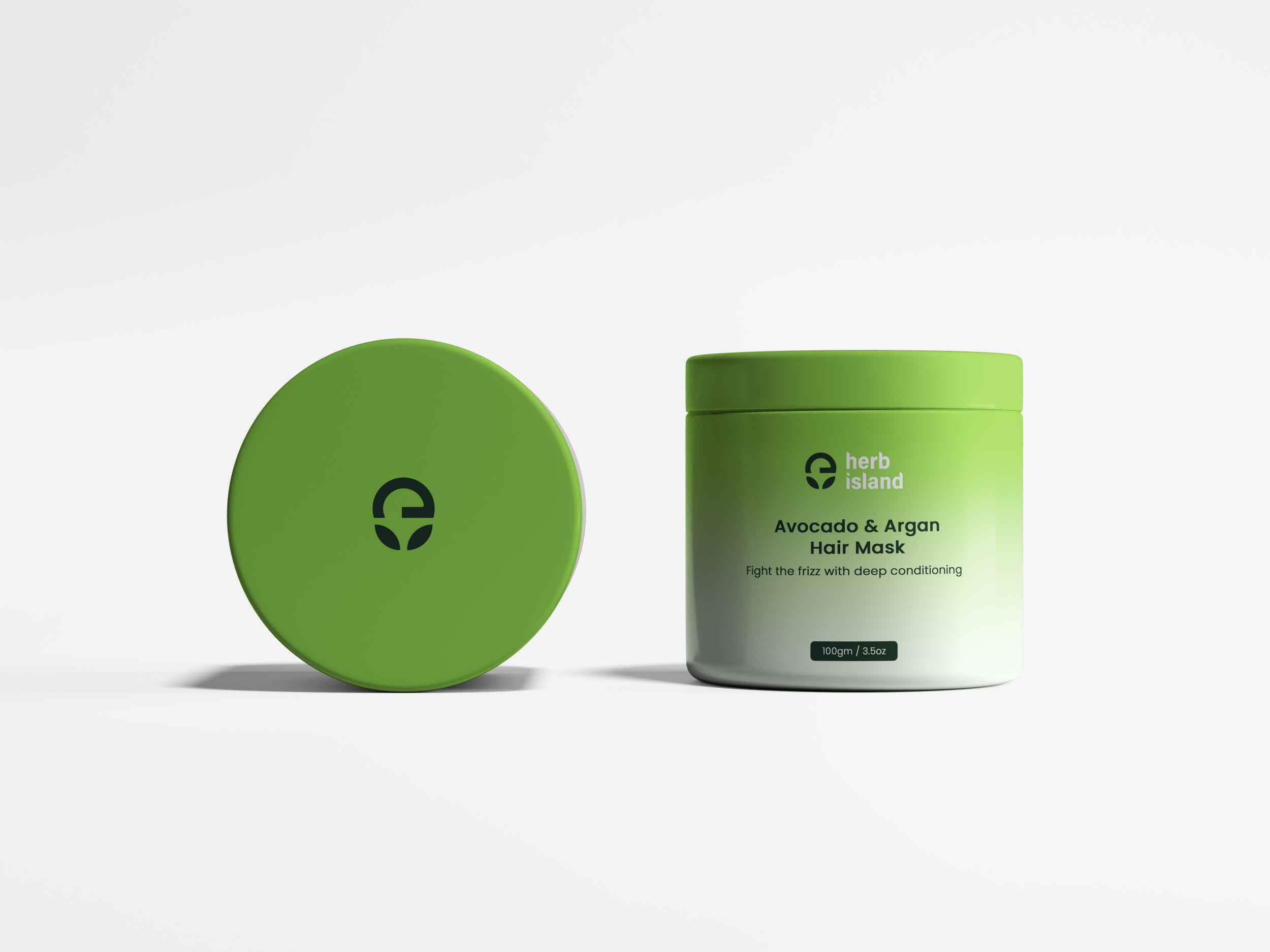
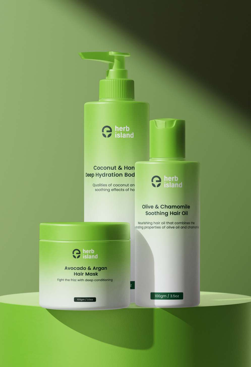
I started by researching customer behavior, looking at what draws people to natural skincare. With this insight, I created a logo, color palette, and typography that felt grounded and inviting. I then moved on to packaging, ensuring that each product visually reflected Herb Island’s promise of affordability and quality. The result was a unified identity that captures the brand’s mission in every design choice.
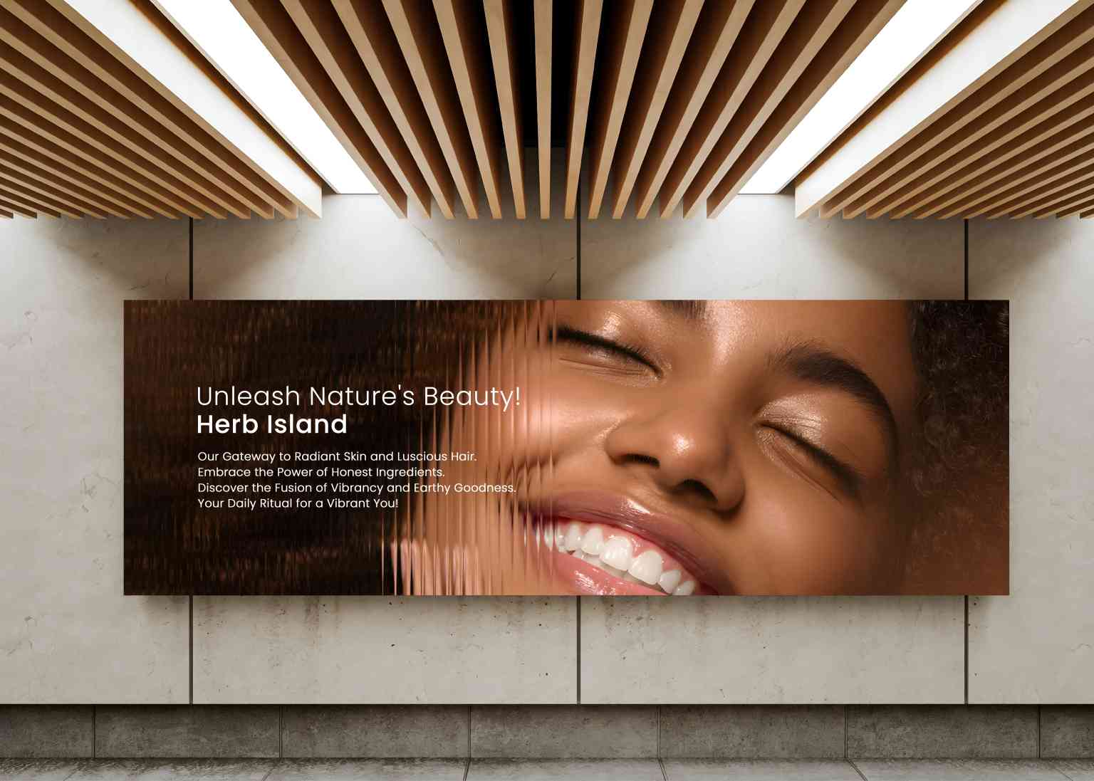
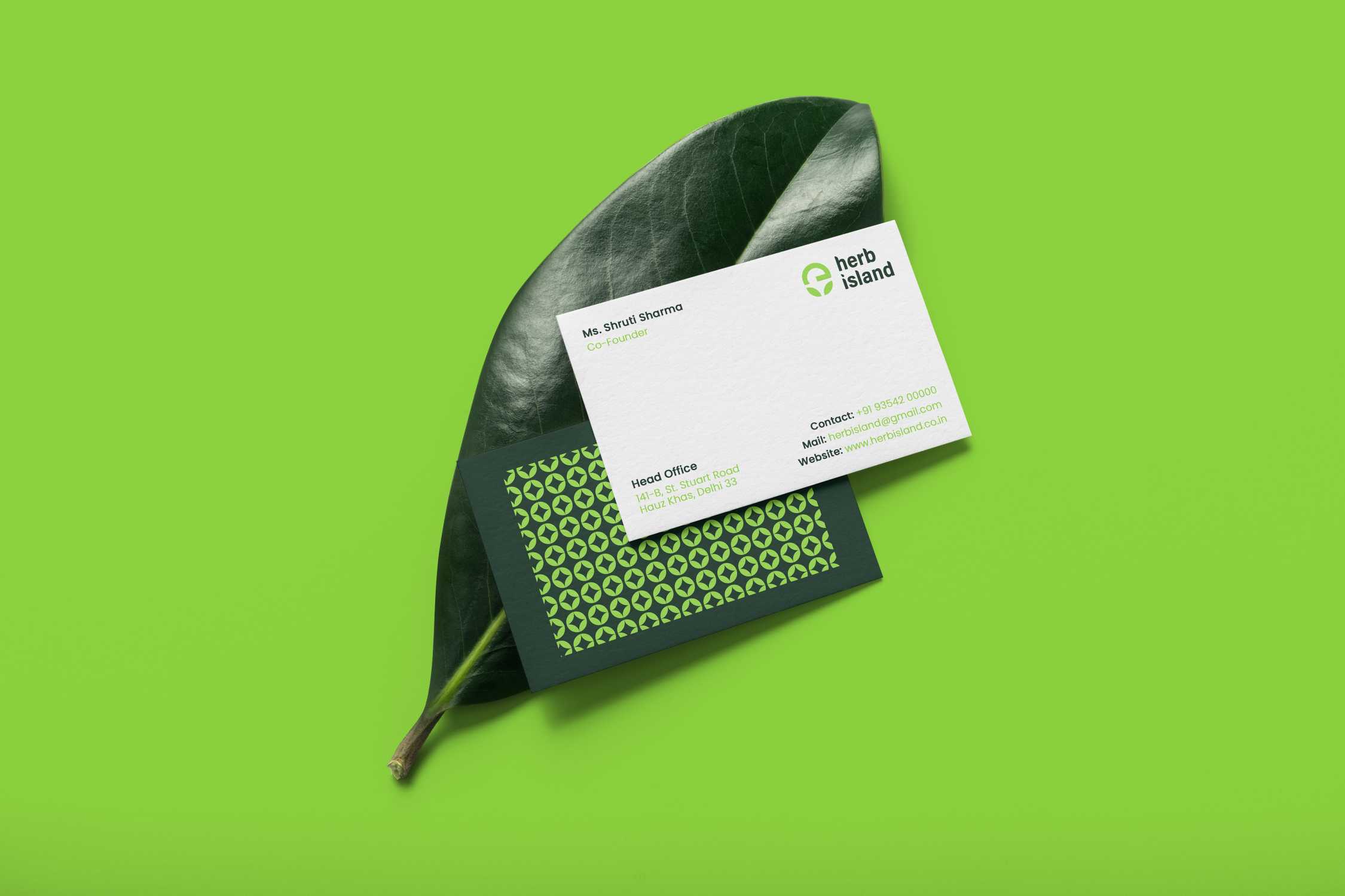
Herb Island’s final brand identity is clean, approachable, and perfectly aligned with its natural, plant-based focus. The logo, packaging, and brand materials create an image of affordability and quality. While this was a passion project, the result is a brand identity that I’m confident would connect well with Herb Island’s intended audience.
BUILDING BLOCKS OF THE PROJECT
BUILDING BLOCKS OF THE PROJECT
BUILDING BLOCKS OF THE PROJECT
LOGO DESIGN
LOGO DESIGN
LOGO DESIGN
VISUAL IDENTITY DESIGN
VISUAL IDENTITY DESIGN
VISUAL IDENTITY DESIGN
PACKAGING DESIGN
PACKAGING DESIGN
PACKAGING DESIGN
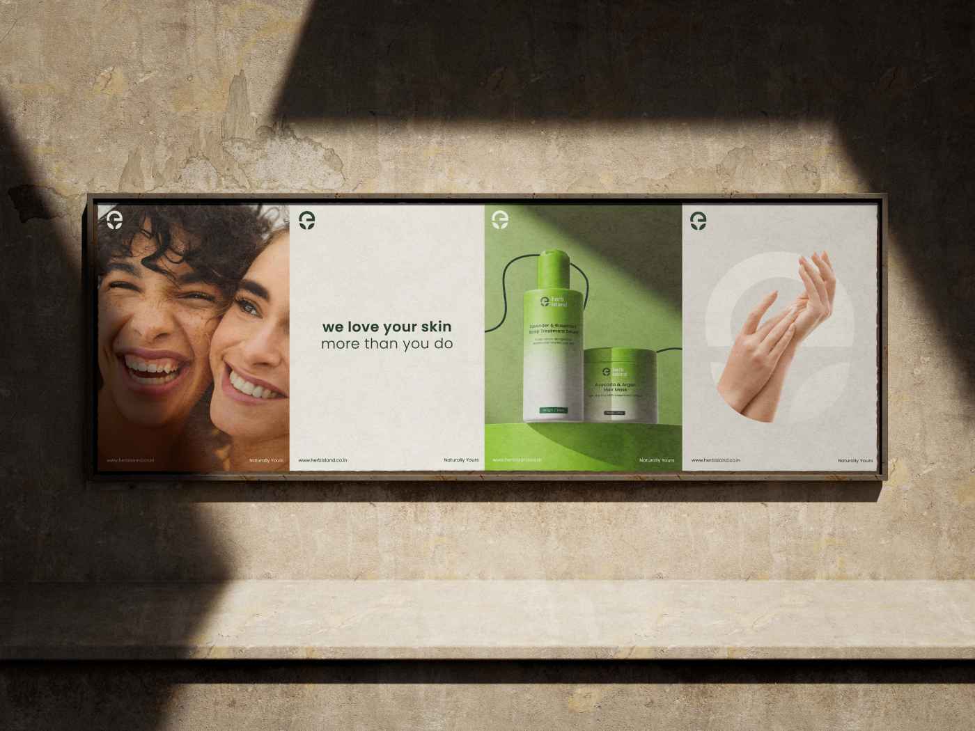








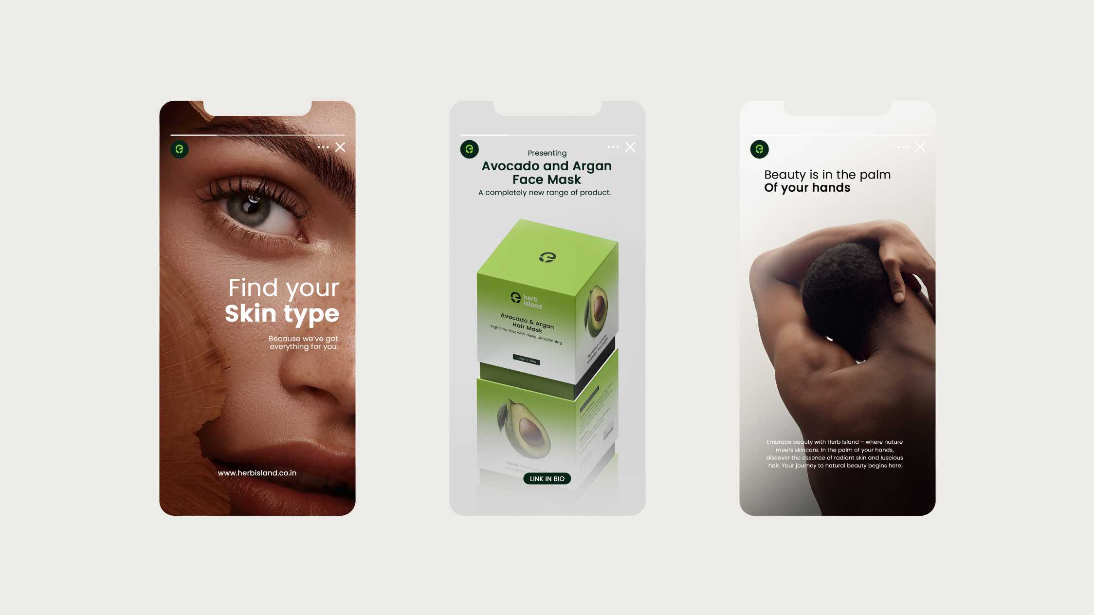
Herb Island demonstrates how effective design can bring a brand’s mission to life. For potential clients, it shows my approach to building brand identities that balance quality with accessibility, illustrating that well-thought-out design can appeal to a broad audience without losing its purpose.
Herb Island demonstrates how effective design can bring a brand’s mission to life. For potential clients, it shows my approach to building brand identities that balance quality with accessibility, illustrating that well-thought-out design can appeal to a broad audience without losing its purpose.
BACK TO HOME
BACK TO HOME
BACK TO HOME
BACK TO HOME
BACK TO HOME

