(01)
(01)
(01)
Ant Works:
A New VISUAL Identity to Elevate a Growing PR Firm
Ant Works:
A New VISUAL Identity to Elevate a Growing PR Firm
Ant Works:
A New VISUAL Identity to Elevate a Growing PR Firm
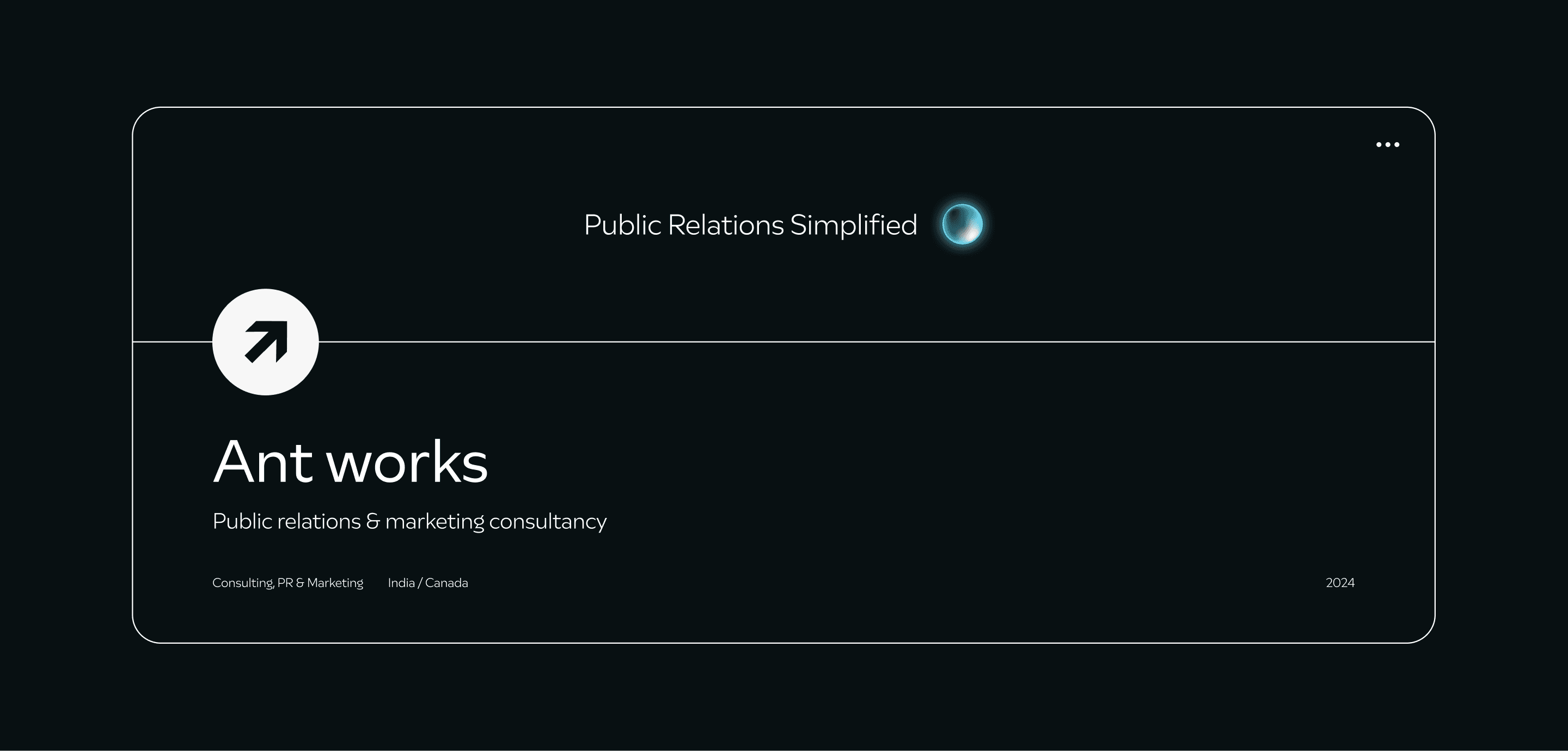
AntWorks, a PR and digital marketing firm founded by Anirudh, had been running successfully for a few years. With plans to expand from Riyadh to Canada, Anirudh decided it was time to create a strong, professional brand identity for AntWorks. He wanted something modern, trustworthy, and memorable that would make the firm known by its brand, not just by his name.
AntWorks, a PR and digital marketing firm founded by Anirudh, had been running successfully for a few years. With plans to expand from Riyadh to Canada, Anirudh decided it was time to create a strong, professional brand identity for AntWorks. He wanted something modern, trustworthy, and memorable that would make the firm known by its brand, not just by his name.
AntWorks, a PR and digital marketing firm founded by Anirudh, had been running successfully for a few years. With plans to expand from Riyadh to Canada, Anirudh decided it was time to create a strong, professional brand identity for AntWorks. He wanted something modern, trustworthy, and memorable that would make the firm known by its brand, not just by his name.
2024
2024
2024
Industry:
Communication & Marketing
Industry:
Communication & Marketing
Industry: Communication & Marketing
Services:
Visual Identity
Services:
Visual Identity
Services: Visual Identity
Client:
Anirudh Das,
Founder | Ant Works
Client:
Anirudh Das,
Founder | Ant Works
Client: Anirudh Das, Founder at Ant Works

We set out to make something modern, trustworthy, and memorable that would make the firm known by its brand, not just by his name.
We set out to make something modern, trustworthy, and memorable that would make the firm known by its brand, not just by his name.
We set out to make something modern, trustworthy, and memorable that would make the firm known by its brand, not just by his name.
Compelling Event →
Compelling Event →
Compelling Event →
With a clear vision and awareness of design trends, Anirudh reached out to me to help create an identity that would set Ant Works apart.
Anirudh approached me to design a logo, but after discussing his goals, we quickly agreed that a full brand identity would make a stronger impact. During our initial meeting, Anirudh shared his ideas and expectations, giving a clear direction on what he envisioned for Ant Works.
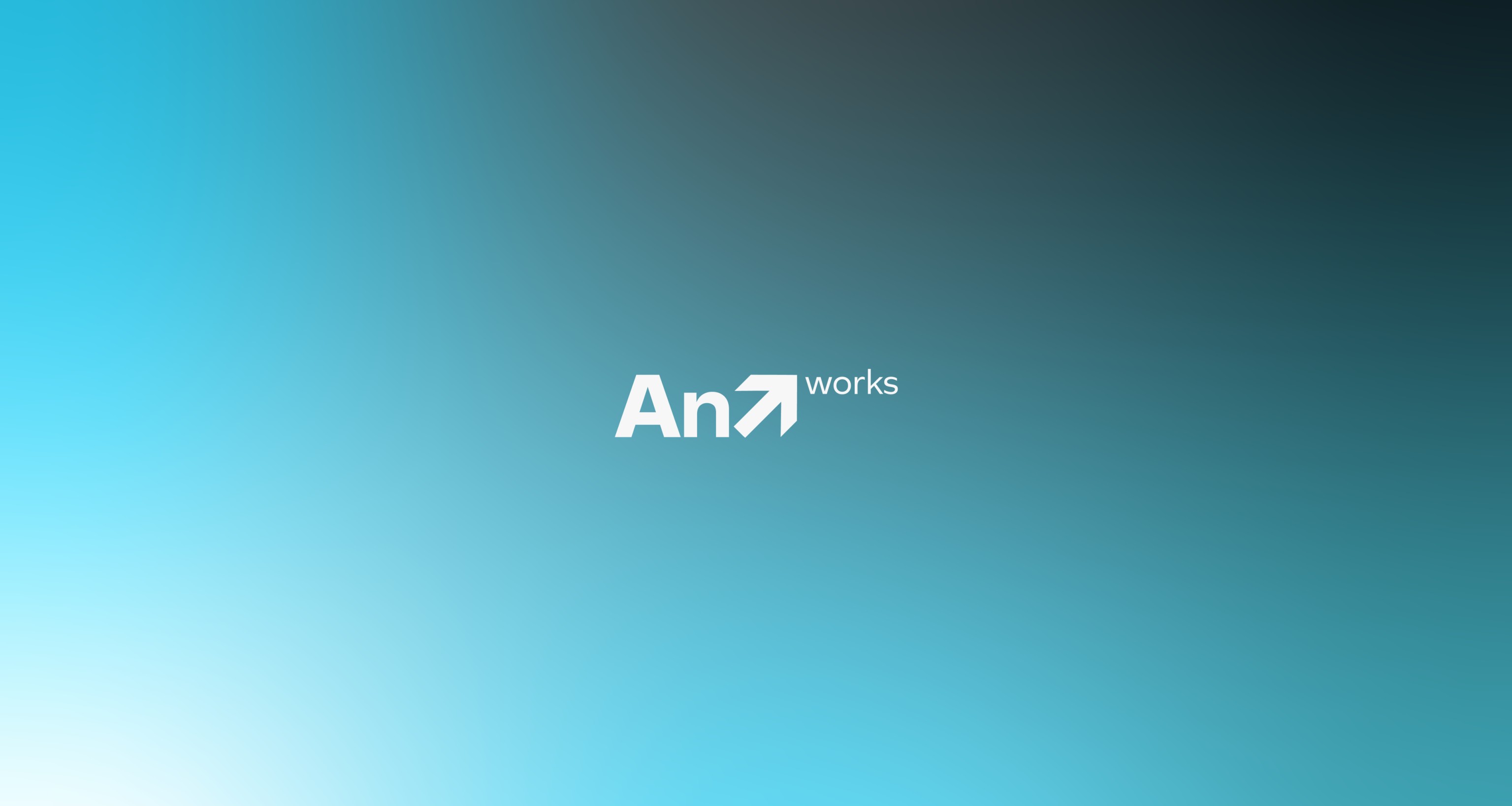
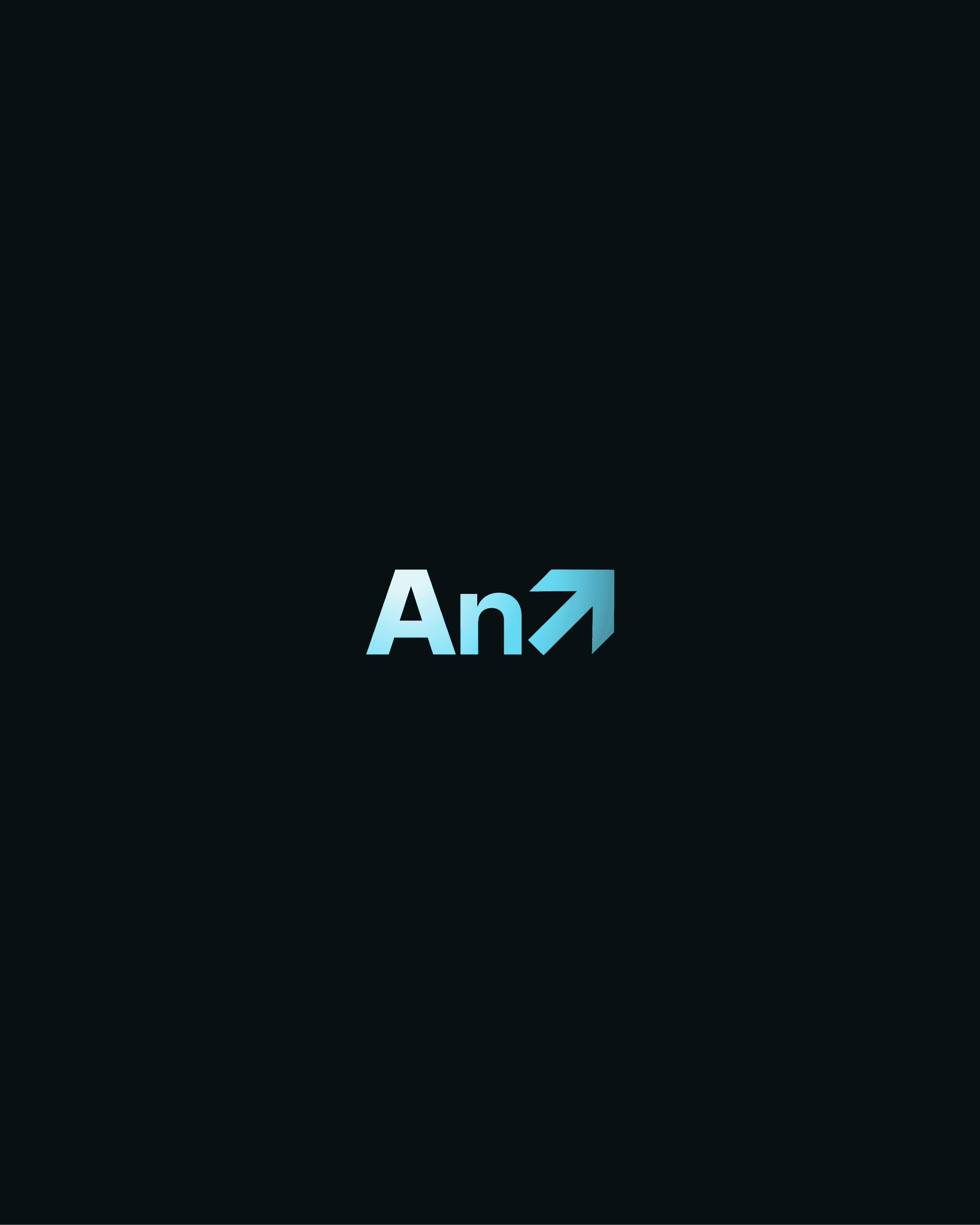
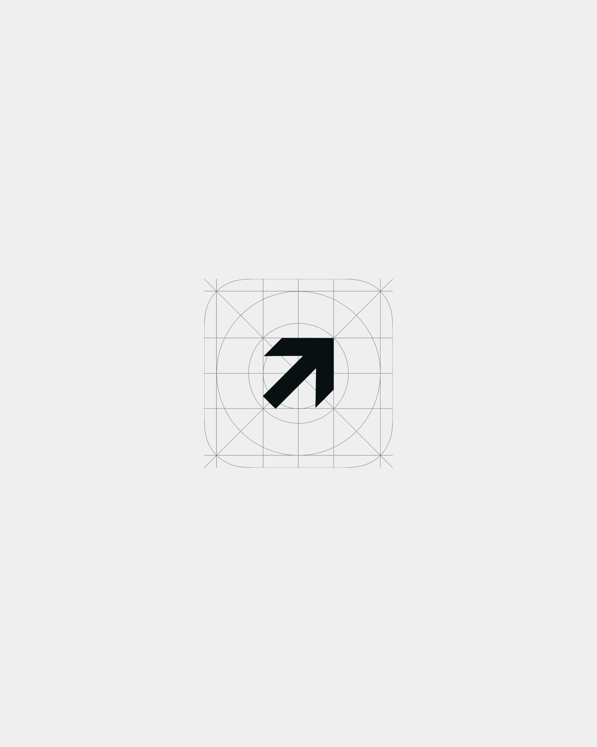
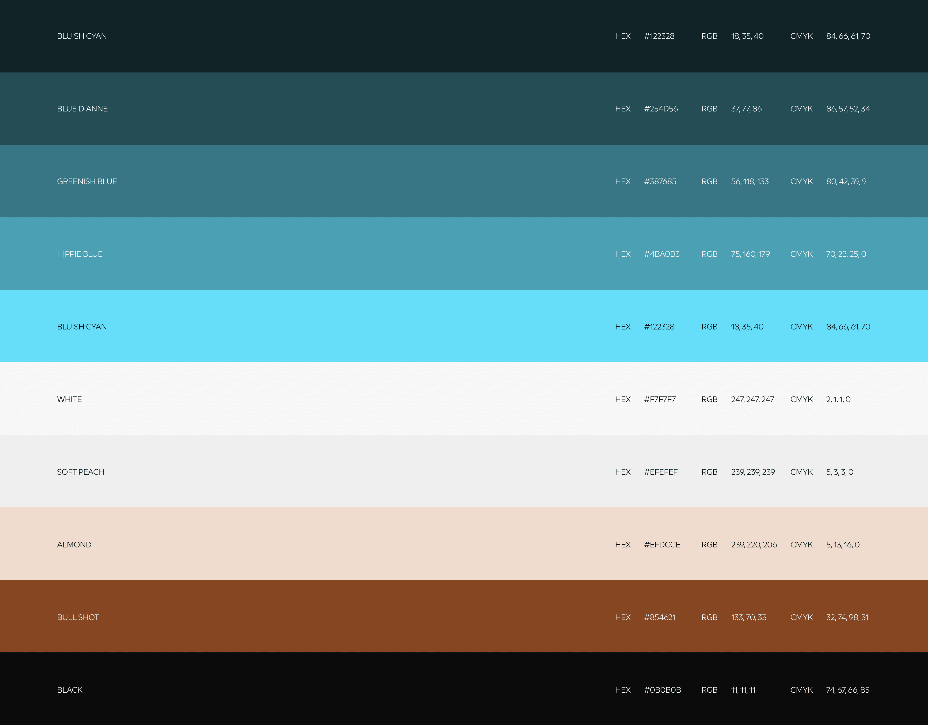
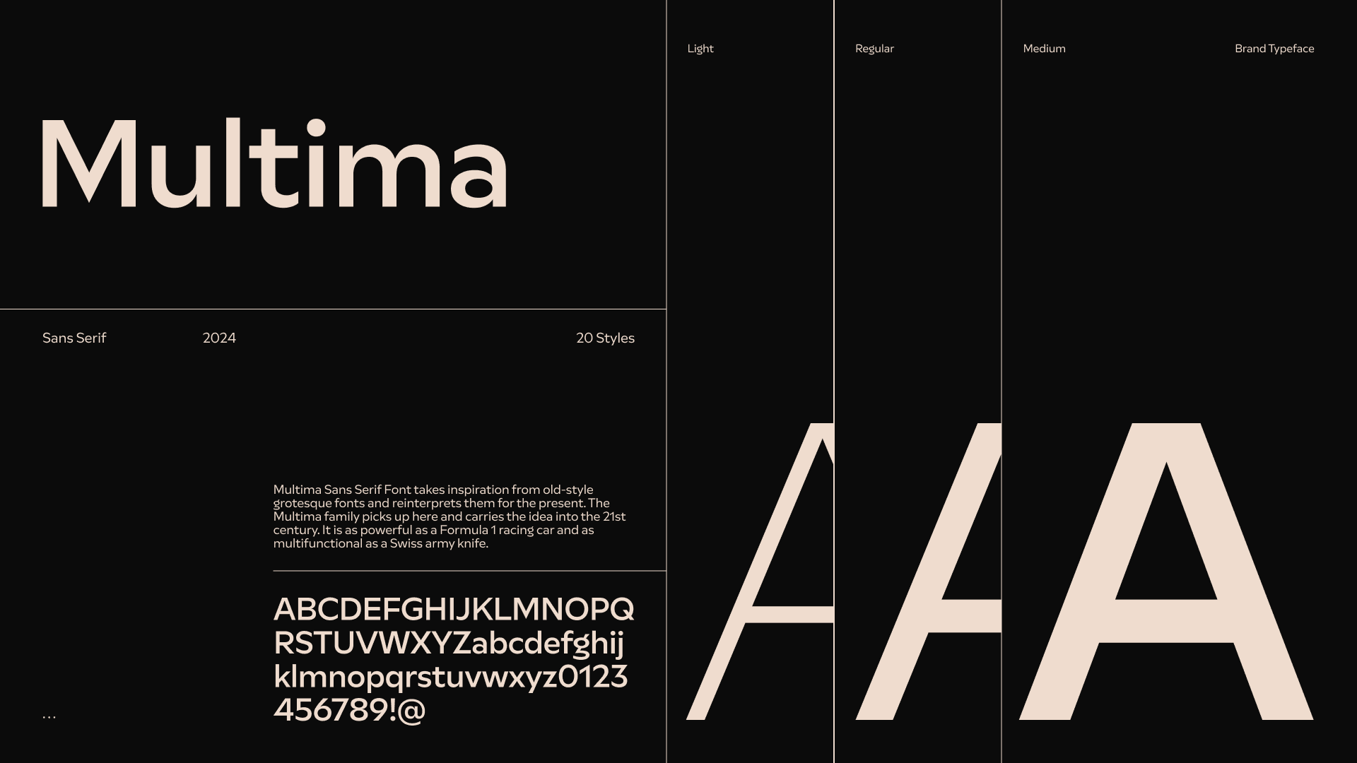
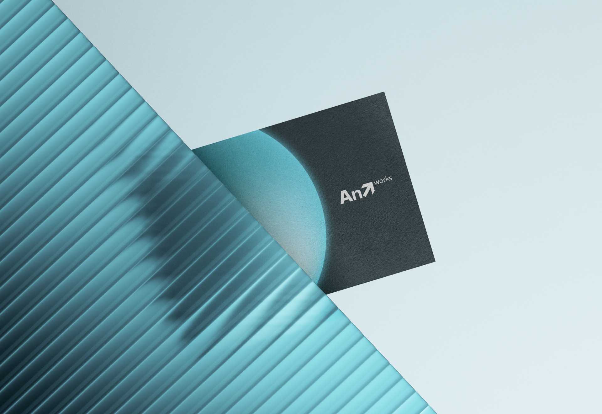
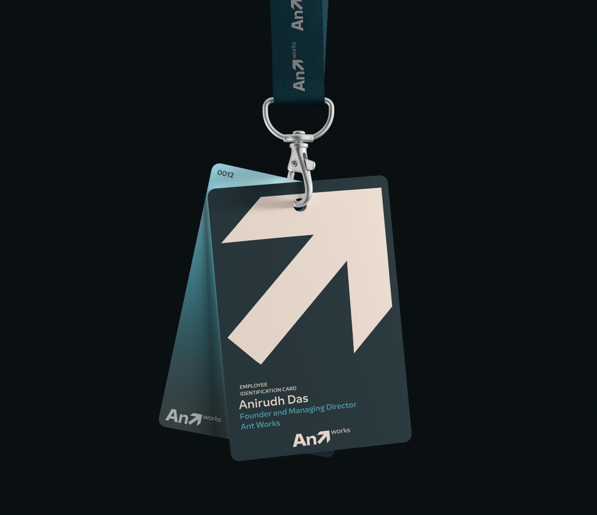
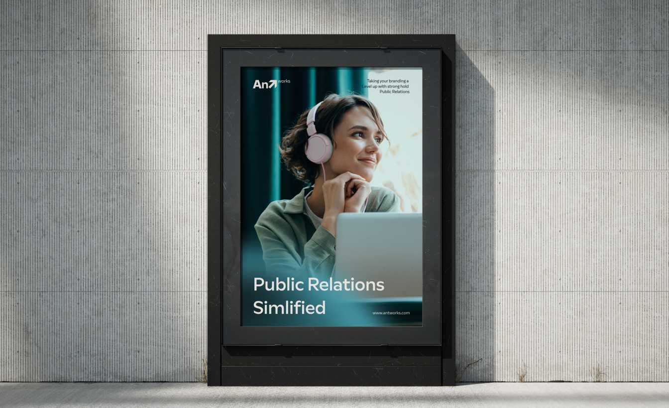
After exploring several options, we settled on a modern wordmark with an arrow in the “T,” symbolizing growth. We chose a blue and aqua color palette for a trustworthy and futuristic feel, and the Multima typeface for its accessible look, fitting AntWorks’ target audience.


LOGO DESIGN
LOGO DESIGN
LOGO DESIGN
EXTENDED VISUAL IDENTITY
EXTENDED VISUAL IDENTITY
EXTENDED VISUAL IDENTITY
STATIONARY DESIGN
STATIONARY DESIGN
STATIONARY DESIGN
SUPPORTING ASSETS
SUPPORTING ASSETS
SUPPORTING ASSETS
BUILDIING BLOCKS OF THE PROJECT
BUILDIING BLOCKS OF THE PROJECT
BUILDIING BLOCKS OF THE PROJECT



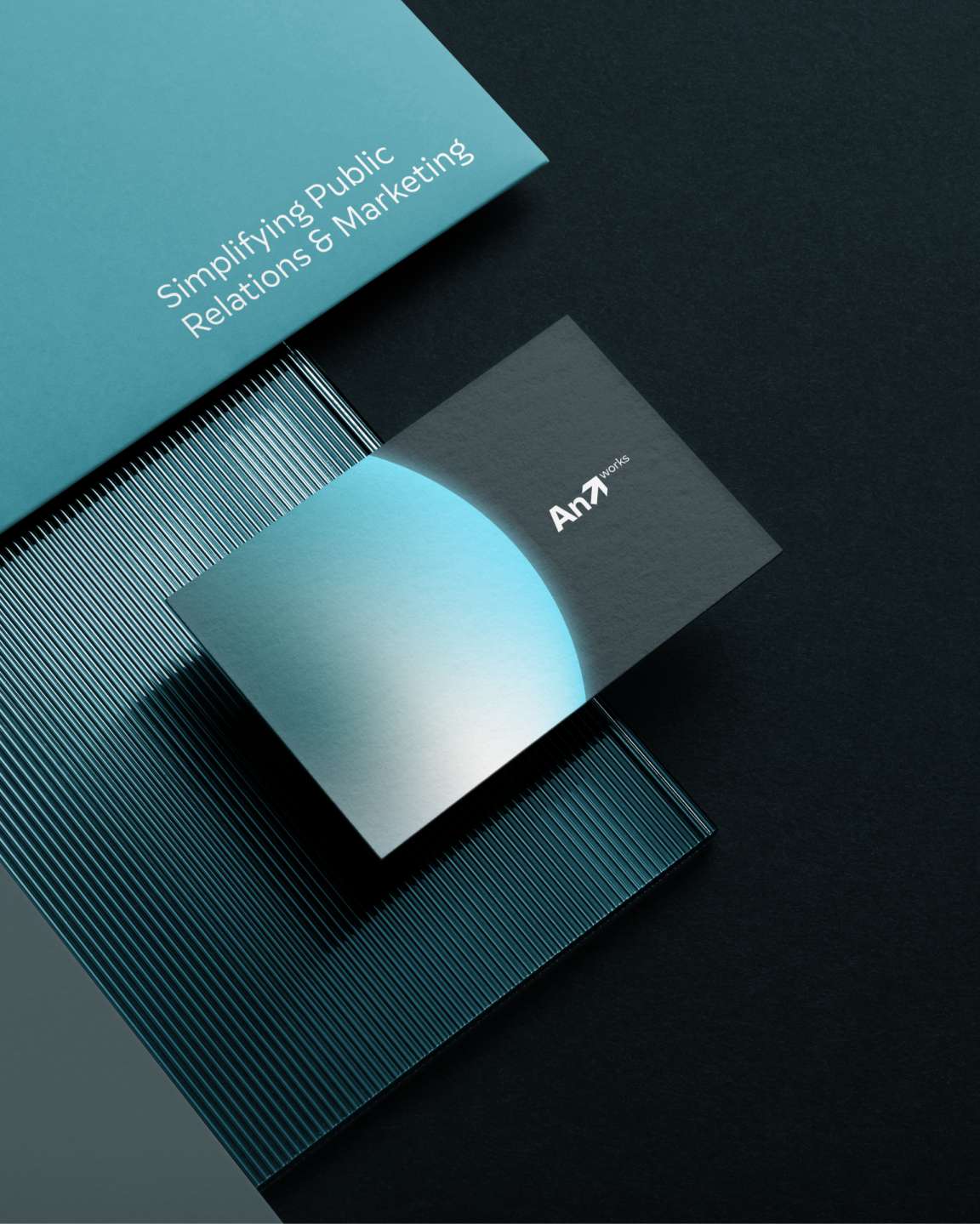
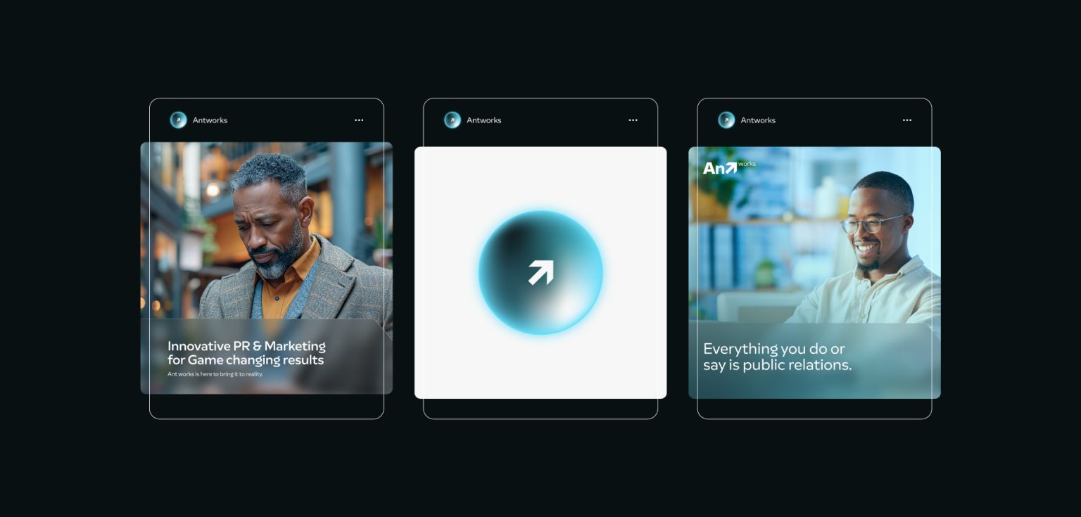
Anirudh had an idea to include a gradient ball, symbolizing a future feature that might allow users to interact with Ant Works more easily. This element became part of the visual identity, adding a forward-thinking touch. Along with this, we finalized other core elements like the color palette, logo, and typography, keeping everything in line with the brand’s modern and professional image.
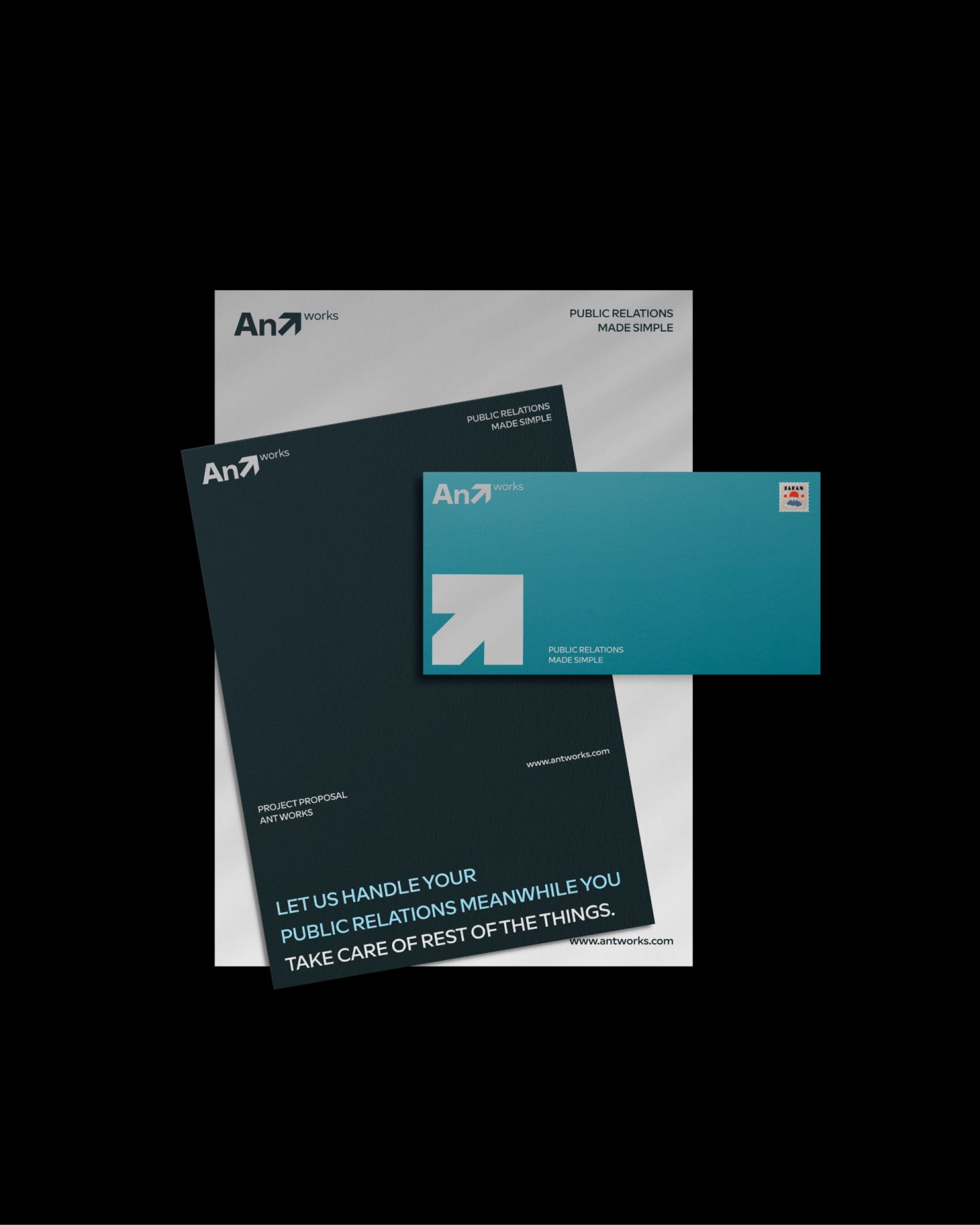
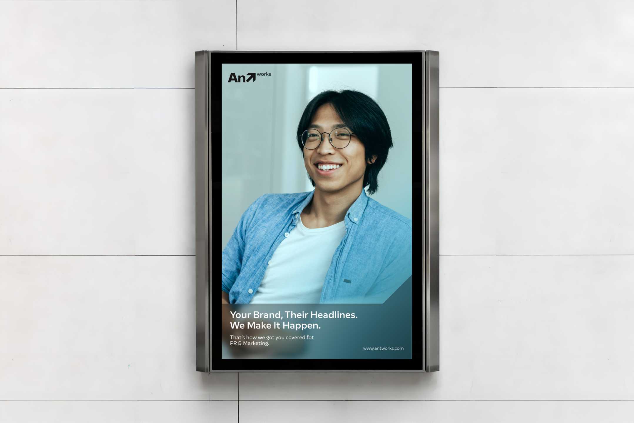
I created a style guide and a full suite of materials, including pitch decks, business cards, and social media templates. This gave Ant Works a consistent, polished look across all their brand assets.
Initially seeking just a logo, Anirudh chose to go for a complete brand identity.
Compelling Event →
With a clear vision and awareness of design trends, Anirudh reached out to me to help create an identity that would set Ant Works apart.
Anirudh approached me to design a logo, but after discussing his goals, we quickly agreed that a full brand identity would make a stronger impact. During our initial meeting, Anirudh shared his ideas and expectations, giving a clear direction on what he envisioned for Ant Works.
After exploring several options, we settled on a modern wordmark with an arrow in the “T,” symbolizing growth. We chose a blue and aqua color palette for a trustworthy and futuristic feel, and the Multima typeface for its accessible look, fitting AntWorks’ target audience.
The outcome was a professional and cohesive brand identity that met Anirudh’s vision perfectly.
The outcome was a professional and cohesive brand identity that met Anirudh’s vision perfectly.
Compelling Event →
Compelling Event →
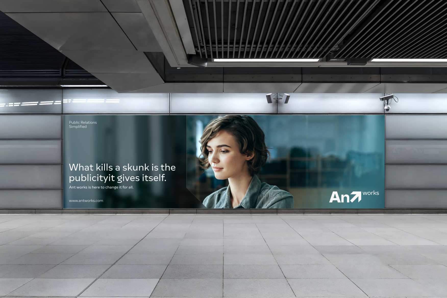
The final brand identity included everything needed for a strong market presence: a modern wordmark logo, a versatile color palette, consistent typography, and an extended identity system. From pitch decks to business cards and other brand materials, Ant Works now has a streamlined, cohesive look that reflects its trustworthy and modern values. The gradient ball element adds a memorable digital touch, aligning with the brand’s future plans.
Anirudh’s team has already started using the brand identity in presentations and client interactions, setting them apart in their industry. While the social media presence rollout is still in progress, the decks and identity assets have provided a polished and professional image for AntWorks as they expand their operations.




The feedback has been positive, with excitement about the brand’s future growth.
The feedback has been positive, with excitement about the brand’s future growth.
The feedback has been positive, with excitement about the brand’s future growth.
The Impact→
The Impact →
The Impact→
After we completed the project, Anirudh was thrilled with the outcome. We spent hours discussing the scalability of the design system and how it would adapt as AntWorks grew. Now operating in Canada, AntWorks has already received positive feedback, affirming that the new brand identity resonates with their audience and positions them strongly in the market.
With a refreshed brand identity, AntWorks is ready to leave a memorable impression in the PR and digital marketing world, carrying forward a brand that stands out with confidence and purpose.
BACK TO HOME
BACK TO HOME
BACK TO HOME

